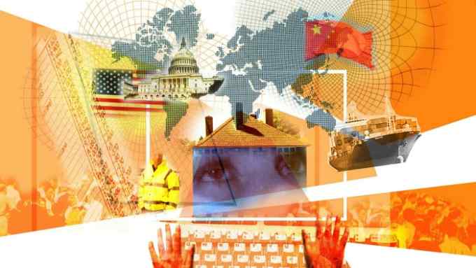
Tomorrow’s world in charts: Gen Z, climate change, China, Brexit and global trade

Roula Khalaf, Editor of the FT, selects her favourite stories in this weekly newsletter.
The earliest charts were invented to show the way the world had changed and, in doing so, provide valuable clues to the future. In an increasingly uncertain world, that fundamental purpose remains as important as ever.
Here are five data visualisations that set historical events in context to inform some of the political, economic and commercial decisions that lie in the years and decades ahead.

Improving life expectancy, lower fertility rates and ever-changing migration patterns mean demographic change is inevitable. Most countries will have older populations in the decades ahead, but some will age much more rapidly than others.
Japan’s population dynamics are well-documented, but other nations, including China, are also destined for major demographic upheaval.
Understanding and managing the economics of demographic change — from early-years care through to retirement — is a challenge that will increasingly vex Generation Z and other cohorts that will be part of very different population structures in the middle of the century.

Three discrete events — the aftermath of the first world war, decolonisation and the fall of communism — helped ensure that the 20th century finished with a record number of countries considered a democracy.
However, the proportion of people dissatisfied with democracy in 2020 stands at 57.5%, the highest since the measure was first recorded in 1995.
Democratic disillusionment is chiefly a western phenomenon, most acute in developed, English-speaking countries. The trend has been accompanied by a rise in populism, which the Centre for the Future of Democracy suggests “may be less a cause, than a symptom” of successive governments that have presided over a series of financial crises and perceived policy failures.
By contrast, citizens of many Asian democracies have successfully avoided the malaise affecting other parts of the world. One notable outlier in this respect is Japan, where a series of scandals have contributed to rising levels of discontent with politicians.

Natural disasters linked to climate change — flooding, drought, wildfires and extreme weather — are being recorded with greater frequency than ever before.
However, the world is also being measured in ever-increasing detail, meaning these historical comparisons highlight the under-reporting of past events as much as they reveal trends of today.
As a result, the real value of this chart lies in the data that will be added to it in the years that lie ahead, providing crucial context on how well humans are looking after the environment that sustains them.

The UK left the European Union on January 31 2020, but a negotiated transition period means it remains in the EU’s customs union and single market until the end of the year.
Despite lengthy and difficult negotiations on a trading relationship from January 1 2021, one thing seems certain: the net economic losers of Brexit are in Europe, while the net winners are set to be those far away from the bloc.
The UK’s departure from the EU means further disruption to global trade patterns that have already changed enormously since the start of the century.

In 2000, a year before China’s entry into the World Trade Organization, the European Union and the US were the world’s dominant exporters, with Japan enjoying a regional advantage in south east Asia and Australasia.
By 2019, China’s surging exports had ended Japan’s regional dominance. Large swaths of the Middle East, Africa and even South America have also fallen under Beijing’s sphere of influence, disrupting global trade patterns established in the second half of the 20th century.
Prior to the Covid-19 crisis, some analysts had suggested we might be at “peak China”. But given the devastating economic impact of the pandemic on the US and Europe, it’s hard to rule out the possibility that this map will change even further in the decades ahead.
The World Ahead: an FT-Nikkei special report

FT and Nikkei journalists look ahead to the next five years after a five-year alliance marked by tumultuous events, from Brexit and the Trump presidency to the coronavirus pandemic. Other articles include:
FT and Nikkei sectoral experts forecast what work, finance, tech, retail and energy will look like in 2025
Martin Wolf, FT chief economics commentator, on the forces that will shape the next five years
Ryosuke Harada, Nikkei senior executive editor, on what the rise of China means for the rest of the world
A visual guide to the data shaping the 2020s and beyond
We asked for your predictions: a woman in the White House, yes, but no progress on climate change

Comments